

Korean Snack Labels make product choices clearer
Korean Snack Labels help parents and buyers understand MOMSMI products before they open the package. A snack label should do more than show a cute design. It should help customers recognize the product type, flavor, serving image, and basic product direction.
MOMSMI uses soft package colors, simple icons, and friendly product visuals to make each snack easier to identify. Yogurt cube products show cube images and flavor cues on the front. This helps families compare cheese, strawberry, and apple-style options more quickly.
For B2B buyers, label clarity can support online product pages, retail shelves, catalogue layouts, and buyer meetings. A clear package design reduces confusion when a Korean baby snack enters a new market. It also gives customers a smoother first impression of the brand.


Ingredient Label Guide for fruit snack selection
An Ingredient Label Guide becomes useful when customers compare fruit-based snacks. Parents often want to know what flavor they are choosing and how the snack fits daily routines. Clear front labels help them understand the product at a glance.
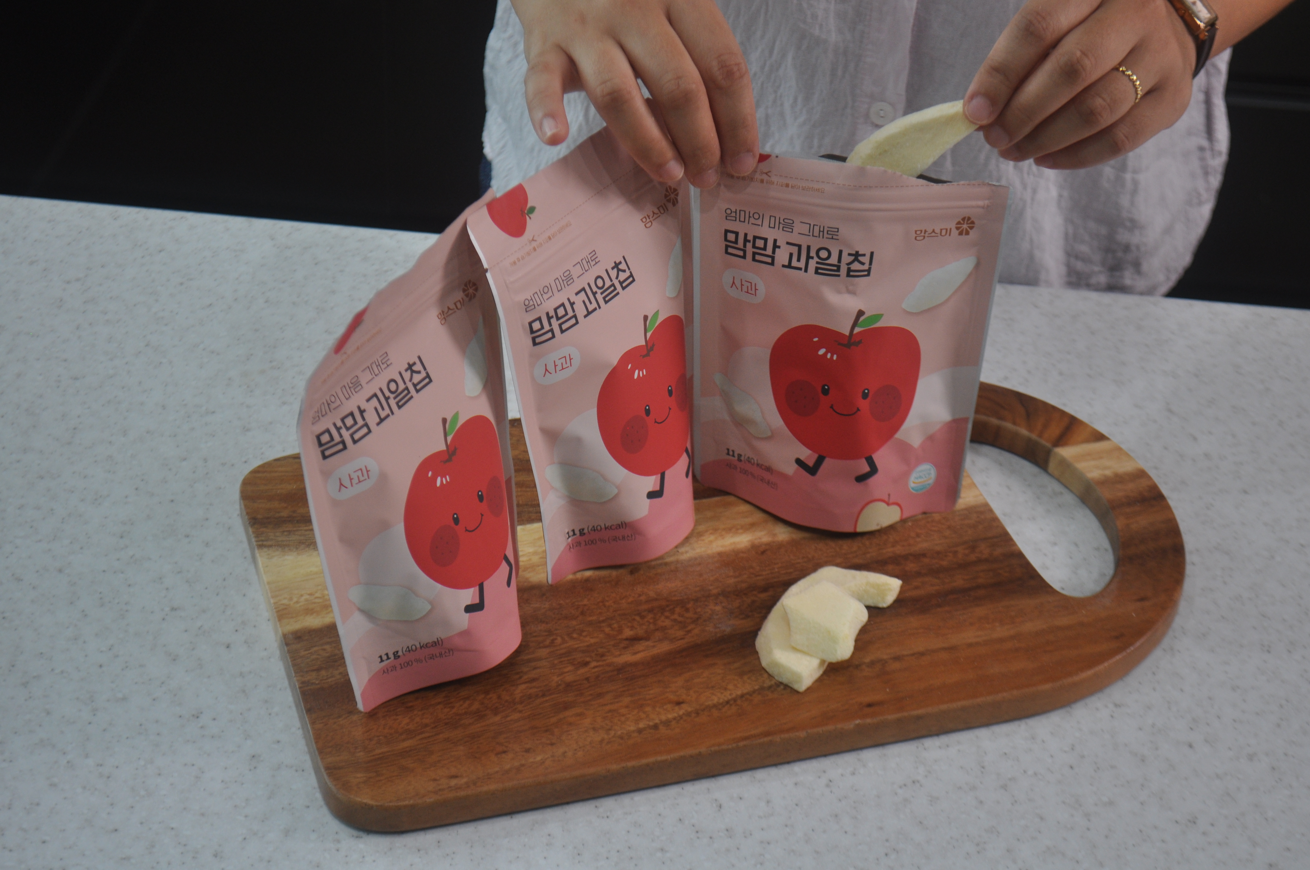
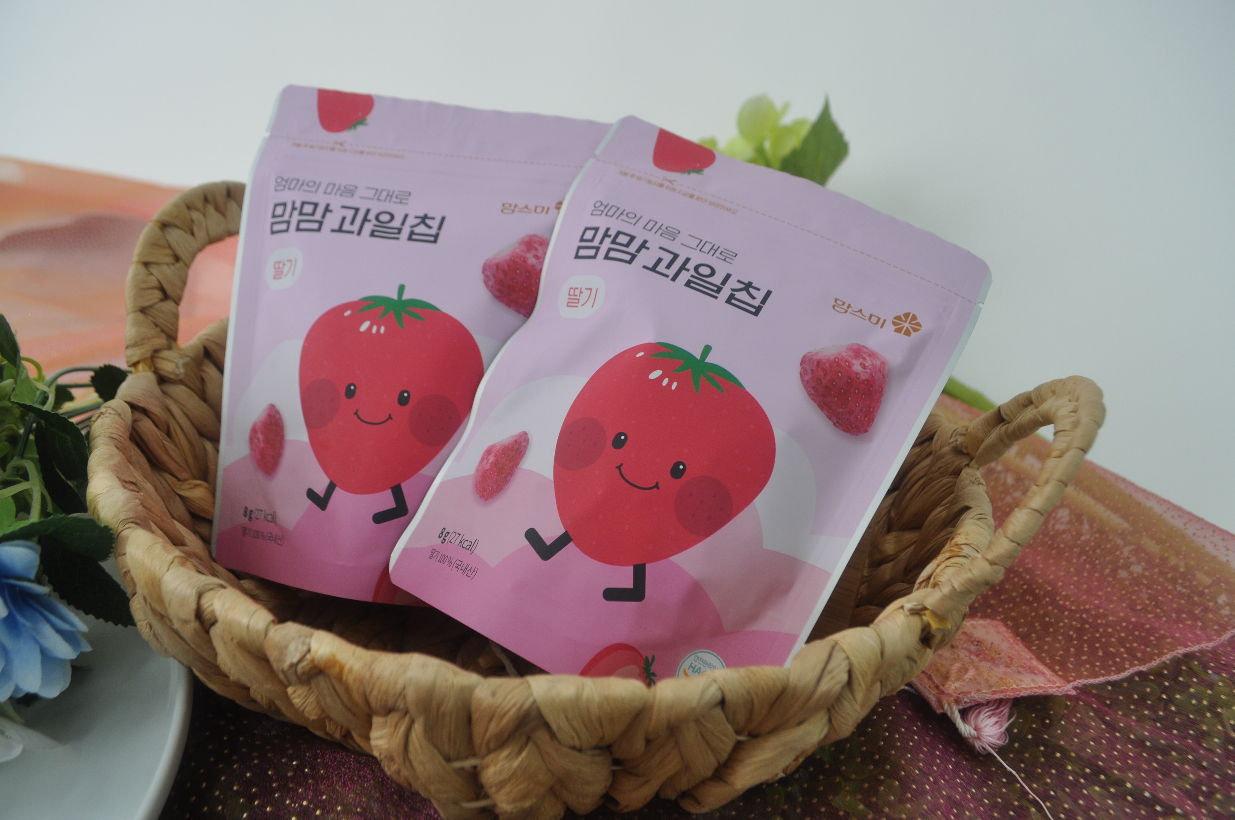
MOMSMI fruit chip packages use fruit characters, flavor names, and soft color groups to separate each item. Apple fruit chips, for example, show a direct fruit image that makes the product easy to recognize. The serving photos also show how the snack can move from package to plate.
This visual flow helps B2C customers feel more comfortable during product selection. At the same time, importers and retailers can use the label information to explain the lineup without long descriptions. Clear labels make Korean fruit snacks easier to introduce in English-speaking markets.


Korean Snack Labels connect design with product information
Korean Snack Labels become stronger when the front design and back information work together. The front side gives customers a quick product impression. The back side gives more detailed information for review.
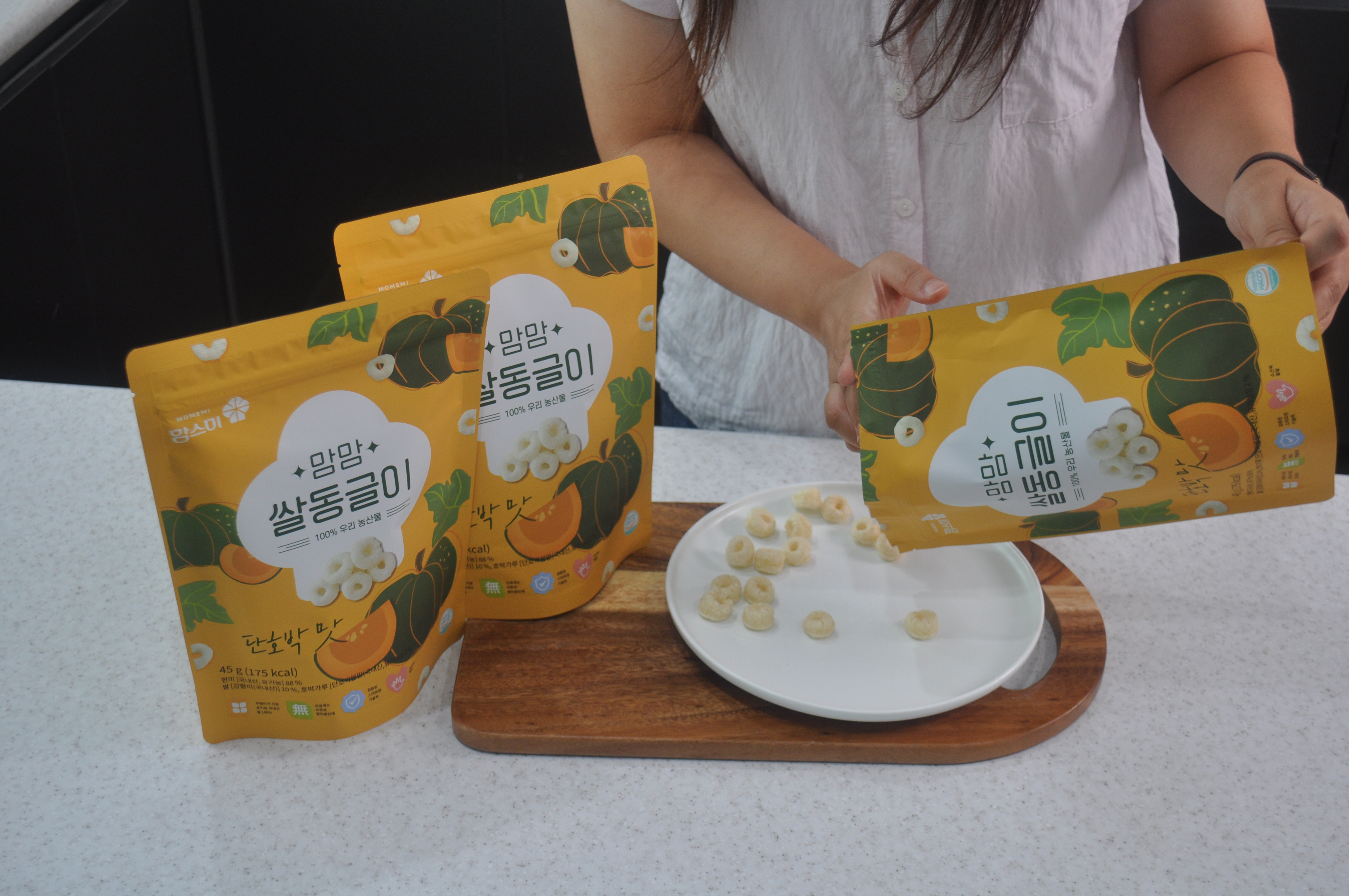
MOMSMI rice snack packages show both product identity and practical label details. The front package design introduces the snack type and flavor. The back label area gives customers a place to check nutrition facts, ingredient information, storage notes, and product details.
This balance matters for parents who want a simple snack choice with enough information behind it. Buyers also need this structure when they review products for local retail channels. A package with clear label areas can support sourcing discussions, translation planning, and online listing preparation.


Ingredient Label Guide builds global retail trust
An Ingredient Label Guide can help global buyers compare MOMSMI snacks across different product lines. Rice sticks, rice puff products, fruit chips, and yogurt cubes each need a clear label story. Customers should understand what the product is, how it differs from other snacks, and where to find key information.
MOMSMI supports this need through organized package design, visible product names, flavor colors, nutrition panels, and certification icons shown on the package. These details help parents review the product with more confidence. They also help retailers prepare product pages and shelf communication more easily.
For overseas markets, label clarity becomes part of brand trust. MOMSMI can present its snacks as Korean baby and family snacks with clean product communication, careful production, and practical retail value. For more product details, visit the MOMSMI official website. You can also read our internal article, MOMSMI baby snack guide.


Leave a Reply