


Snack Color Identity Helps Customers Recognize Products
Snack Color Identity helps MOMSMI products feel clear and easy to understand at first glance. Before customers read detailed product descriptions, they often notice package color, product image, and snack category first. MOMSMI uses these visual elements to make each product easier to recognize.
This matters for both families and global buyers. Parents may compare snacks quickly when they shop online or in stores. Buyers may review many product options during sourcing, catalogue planning, or retail display preparation. A clear color system helps both groups understand the lineup without confusion.
MOMSMI products include rice snacks, fruit chips, yogurt cubes, and family snack items. Each category can carry a different visual mood. As a result, Snack Color Identity becomes a useful way to explain product variety, flavor direction, and shelf appeal in one simple story.


Package Colors That Help Customers Compare Products
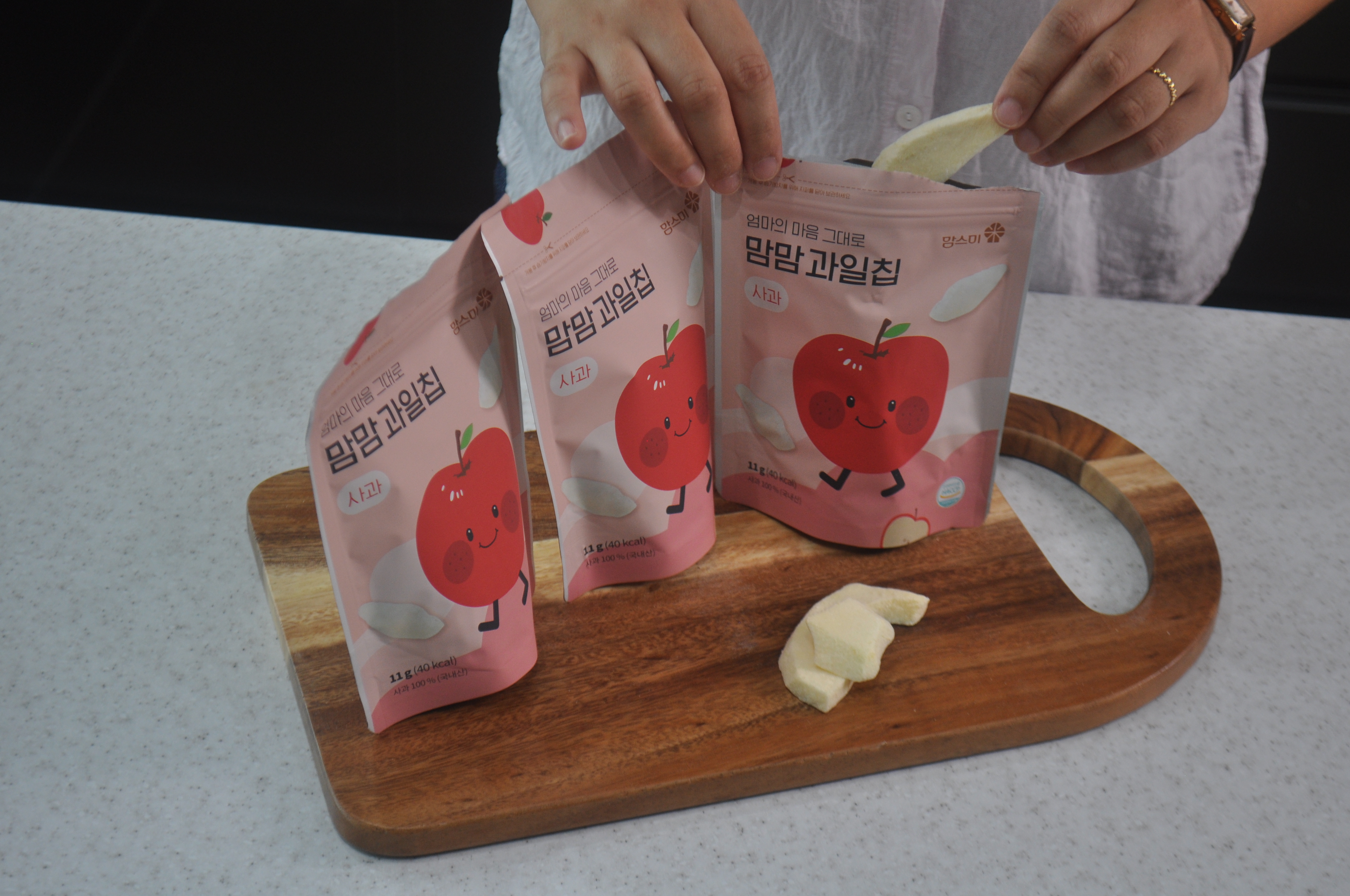
Package colors can help customers compare MOMSMI products more easily. Fruit chip products can use fruit-related colors to show flavor. Yogurt cube products can use soft and friendly colors to create a gentle snack image. Rice snack products can use clean and bright designs to show mild daily snack use.
This visual structure is useful because customers often make quick decisions. On an online product page, they may compare several package thumbnails at once. In a store, they may notice color and product image before checking details such as ingredients, serving size, or product description.
For B2B buyers, this color-based organization can support retail planning. Stores can group products by category, flavor, or target customer. Online sellers can also use clear package colors to make product pages easier to browse. In this way, MOMSMI packaging can help customers move from first impression to product understanding.


Snack Color Identity in the MOMSMI Lineup
Snack Color Identity becomes stronger when different products appear together as one lineup. MOMSMI can show rice sticks, rice puff balls, rice puffs, fruit chips, yogurt cubes, corn-style snacks, and other family products with a consistent brand image. At the same time, each product keeps its own category identity.
This balance is important. If all packages look too similar, customers may not notice the difference between products. If every package looks too different, the brand may feel less organized. MOMSMI can use color, product photos, and package layout to keep both variety and unity.
For families, this makes product selection more comfortable. They can choose a snack by product type, taste image, or eating situation. For buyers, the lineup becomes easier to explain on shelves, in catalogues, and during export discussions.


Visual Identity That Supports Global Product Communication
A clear visual identity can help MOMSMI communicate with global customers more effectively. Overseas buyers may not know every Korean product name at first. However, they can still understand product categories through color, package images, and simple visual cues.
This is especially useful for Korean baby and family snacks. Rice snacks can be introduced as mild everyday options. Fruit chips can show a lighter fruit-based snack image. Yogurt cubes can add a colorful bite-sized category. Other family products can expand the lineup for broader retail use.
With Snack Color Identity at the center, Eumsae Agricultural Corporation can present MOMSMI as a Korean snack brand with clear product organization and strong visual appeal. The package colors help customers notice the product. The product images help them understand the snack. Together, these details make the lineup easier to introduce to families, retailers, and global buyers.



Leave a Reply